OVERVIEW
The Yamato Transport app helps millions of people in Japan send and receive parcels. However, for the growing number of foreign residents, its Japanese-only interface creates barriers.
In this project, I explored how thoughtful UX writing — not just translation — could make the app more inclusive for anyone, regardless of their native language.
THE
PROBLEM
While Yamato Transport's app supports millions of users across Japan, there's currently:
-
No welcome screen
-
No onboarding flow
-
No language selection options
-
No copy that guides or reassures new users
For non-Japanese speakers, this creates an immediate barrier before they even begin using the app’s services.
OBJECTIVE
To introduce Yamato’s first onboarding experience that:
-
Welcomes users in multiple languages
-
Offers a clear, simple language selection process
-
Sets a friendly, trustworthy tone from the very first screen
ROLE
As a solo UX writing project, my focus is on how language, tone, and structure could transform the user’s first few seconds in the app.
Gather user insights and pain points
Guide users through the onboarding flow
Focus on accessibility and inclusivity
Apply and extend existing brand voice
Disclaimer: This is an independent concept project. All analysis and design decisions were made for practice and demonstration, and do not represent Yamato Transport’s official product or processes.
THE DESIGN
PROCESS
Understanding the User and Context
Japan’s digital ecosystem still assumes most users are fluent in Japanese. But that’s changing. As of January 1, 2024, there are 3.32 million foreign residents in Japan — about 2.66% of the population — and this number is expected to rise to 10–11% by 2070 (Ministry of Internal Affairs and Communications). Yamato’s app experience should evolve alongside this reality.
What I Reviewed
-
Existing Yamato app flow and copy patterns
-
How quickly first-time users can locate core tasks
-
Clarity and accessibility of language (especially for non-Japanese speakers)
Why It Matters
-
Japan’s foreign resident population continues to grow, increasing the need for multilingual-friendly delivery experiences.
-
Delivery tasks (tracking, redelivery, notifications) are often done on the go, making clarity essential.
Key User Realities
-
Users want fast orientation to what the app does.
-
Non-native speakers can struggle with delivery-specific terms.
-
Most interactions are time-sensitive and require minimal friction.
Opportunities Identified
-
Clearer onboarding to introduce essential features quickly
-
Consistent, simple terminology for both local and international users
-
Highlighting high-frequency tasks (tracking + redelivery) upfront
How This Informed the Redesign
-
Prioritized approachable, multilingual-friendly microcopy
-
Reduced cognitive load through clearer explanations
-
Structured onboarding around the tasks users perform most
Exploring solutions
To understand the needs of foreign users, I explored a typical scenario and pain points they might face when first using the Yamato app. This helped guide our ideation toward a smoother, more accessible onboarding experience. To bring this concept to life and to keep users at the heart of the redesign, I will introduce Maria, a representation of Yamato's foreign market.
Scenario
Maria, a frequent online shopper, just relocated to Yokohama, Japan. She wants to create a Yamato account to manage deliveries from her smartphone while she’s out. She hopes to schedule, reschedule, and track packages easily, but the current app is confusing or hard to navigate as she doesn’t read Japanese at all.
User Emotions
Excited
Anxious
Hesitant
Frustrated
Yamato’s Goal
Make it effortless for Maria to create an account and manage her deliveries. Provide guidance and reassurance so she can confidently schedule, reschedule, and track packages from her smartphone without barrier.
Yamato's Tone
Warm & welcoming
Clear & supportive
Neutral & accessible
Friendly
Direct & Helpful
Wordbank
Friendly & Welcoming Words
-
Welcome
-
Hello
-
Hi there
-
Greetings
-
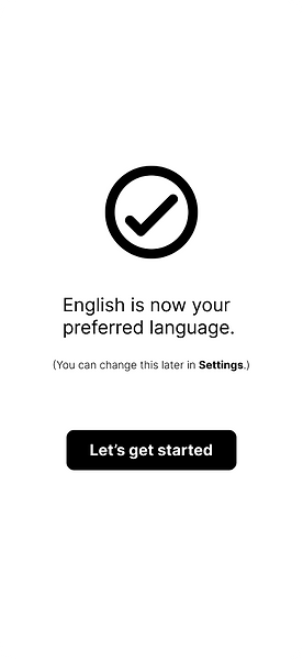
Let’s get started
-
Ready
-
Explore
-
Begin
Guidance/Helper Words
-
Here’s how it works
-
Quick tip
-
Need help?
-
Learn more
-
Follow these steps
-
Let’s walk through it
-
You can update this later
-
We’ll show you how
Reassurance &
Confirmation Words
-
All set
-
You’re good to go
-
That’s confirmed
-
Looks good
-
Saved successfully
-
Done — nice!
-
You’re all set here
-
Everything’s ready
Clear Action/ Instruction Words
-
Select
-
Tap
-
Continue
-
Confirm
-
Next
-
Start
-
Save
-
Try again
-
Update
Inclusive & Supportive Words
-
Choose what works for you
-
Your language, your way
-
You’re in control
-
No worries
-
We’ve got you
-
You’re all set
-
Made for everyone
-
Your comfort matters
Following the user's story
To understand how international users first experience Yamato Transport’s app, I mapped out a simplified user journey from the moment they open it to the point where they begin exploring features. This helped me identify several early touchpoints where users lack guidance, context, and language support. These gaps contribute to confusion and slow down task completion, highlighting the need for a clearer, more inclusive onboarding experience.

Content-first design for the onboarding process.
To keep the scope focused, I prioritized language, tone, clarity, and flow. The UI elements shown are intentionally minimal, low- fidelity representations and serve only to contextualize the writing. Content first then design.


Making it real
The prototype below shows the core onboarding flow in its simplest form. There are no animations or special effects at this stage—just the essential screens connected to demonstrate the structure, pacing, and user journey. This bare-bones version highlights the content decisions and layout logic before visual refinement and motion are added.
Click here to expand and explore full screen
Testing and refining
What I Focused On
-
Readability and clarity
-
Tone consistency
-
Alignment with key user tasks
How I Refined the Copy
-
Ensured terminology stayed accessible
for non-native speakers
-
Checked for grammatical and syntactical errors to keep the tone consistent and clean
Light Validation
-
Quick peer check for clarity
-
Read-aloud review to confirm flow and
tone
-
Compared versions to choose the most
concise option
Results
-
Shorter, clearer onboarding
-
More consistent messaging
-
Lower cognitive load for all user groups
See where your package is at any time.
See where your package is anytime.
Send package easily, right from the app.
Send packages easily, right from the app.
KEY TAKEAWAYS
-
First impressions matter: International users face friction without early guidance.
-
Journey mapping is powerful: Visualizing the flow highlighted pain points and opportunities.
-
Language support is crucial: Including early language options felt like a simple but powerful fix.
-
Content-first thinking pays off: Prioritizing copy early made the screens more clear and inclusive.
-
Curious for more: I dive deeper into content-first design in my blog post.